Recently, I've seen some graphics that really bring home the impact of climate change, and I thought I'd share them here.
First is a spiral graphic showing the increase in temperature over the last century and a half.
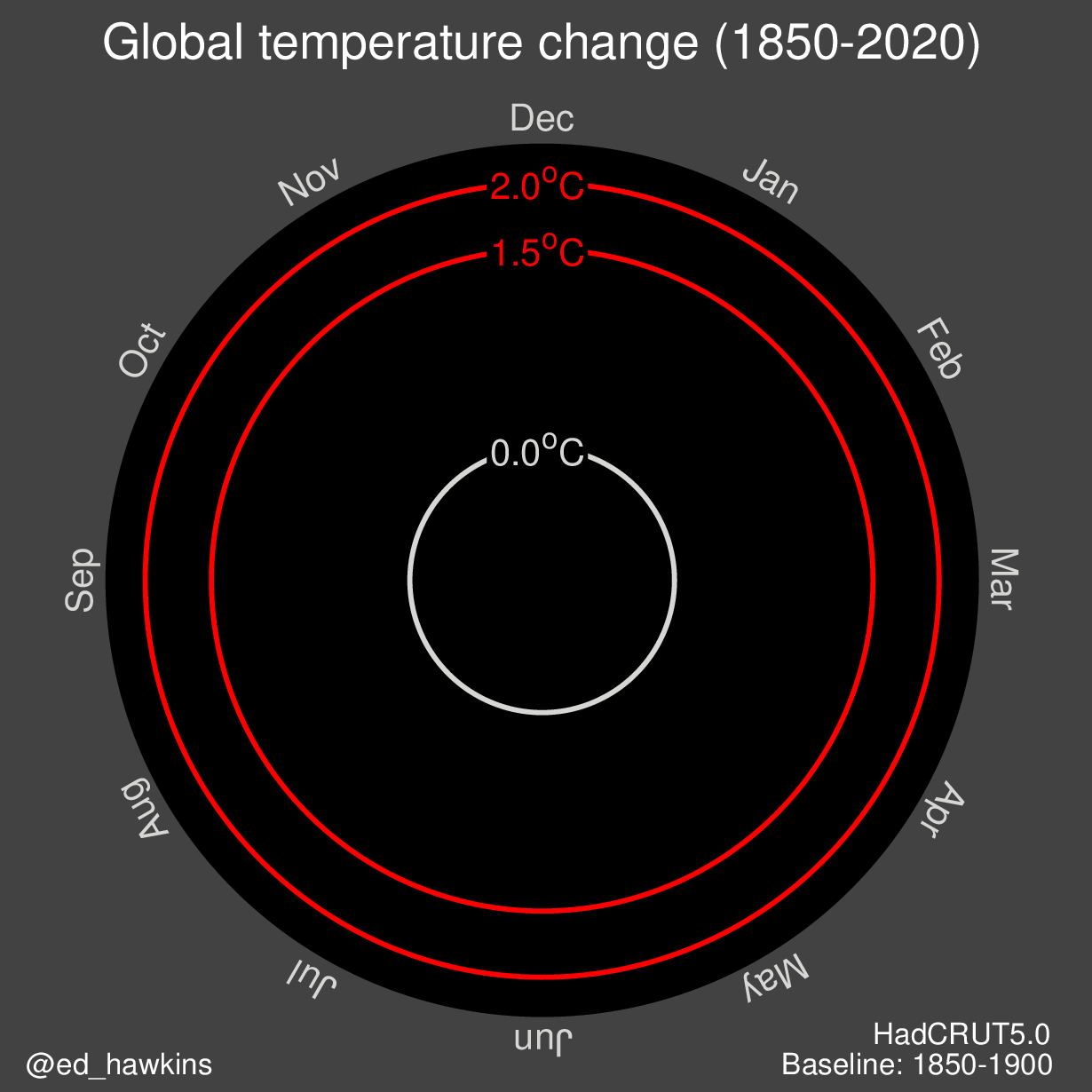
I like this type of graph because it shows both seasonal variations and the temperature range over a period of time, which is also helpfully colour coded.
As this web page shows, the spiral graph can also be used to show CO2 levels in the atmosphere and the extent of arctic ice.
Earlier this week I saw another type of graphic showing the sea level rise in Miami over time. It was posted by Brian McNoldy, a senior researcher at the University of Miami.
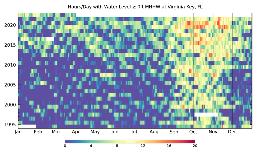
"Each colored rectangle shows the # of hours that the water level spent above the mean high tide level each day in Miami. King Tide season shows up during the Fall, as do a few noteworthy hurricanes, but sea level rise is also a striking feature."
Again, this presents a lot of information in a compact, easily understood format. It's much easier to understand than a table of numbers.
There are many other visualizations of climate change. See this page for more examples.
No comments:
Post a Comment